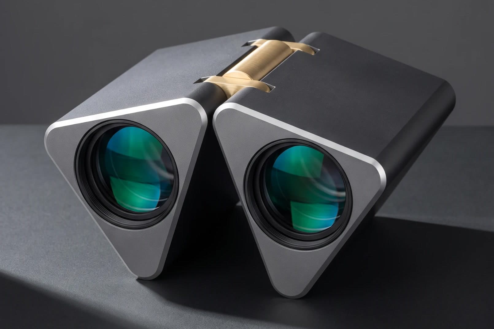
This project started as a quick mockup of an idea I had after noticing how clunky and, frankly, ugly most binoculars are. They are a genuinely useful tool, yet almost nobody has approached them from a user experience point of view. I saw an opportunity to reshape the binocular so it could fold down to a more compact size, and to treat the gap that forms between the two halves as a feature rather than a leftover.
When the two triangular sections hinge together, the space between them leaves clearance for your nose, so the binoculars rest comfortably against your face while you look through them. The flexibility of the hinge lets you dial in the placement and spacing of the lenses until the fit is right for your eyes. Sitting between the two hinges is a knurled metal dial that focuses the image, giving the one control you reach for most a texture your fingers can find without looking.
This was a quick and simple project that I wanted to get out of my head and into a form I could hold up and look at. It was a fun experiment, and it let me keep exploring what happens when common products are rethought from a design and user experience angle.